There is a particular kind of room that exists in many beautiful homes: technically fine, inoffensively neutral, and utterly without soul. The guest bedroom is often the last room to receive attention — a place where furniture arrives by necessity and color never arrives at all. For one of our Connecticut clients, this was precisely the situation. The previous owners had left behind a room that was, in every sense of the word, adequate. White walls. Heavy drapes. A queen bed pointed at a window. A space that communicated, clearly, that a guest bedroom had been placed here, and that was considered enough.
Our client, a woman with an exquisitely edited eye and a closet that would make most people weep with envy, deserved better. So did her guests. What followed was one of our favorite kinds of projects: a quiet transformation that, with intention and restraint, turned a room from invisible into unforgettable.
Project Snapshot
This was a focused refresh of a guest bedroom and the small transitional hallway connecting it to the guest bath — a project that proves, convincingly, that impactful interior design in Connecticut does not require gutting a space. It requires vision.
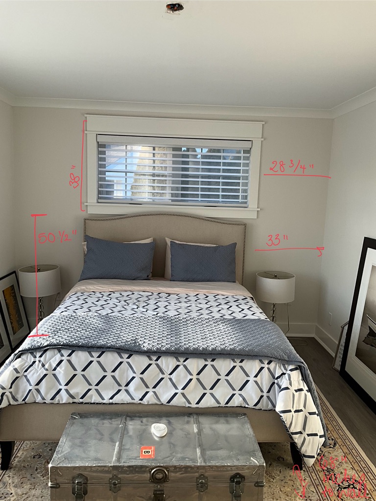
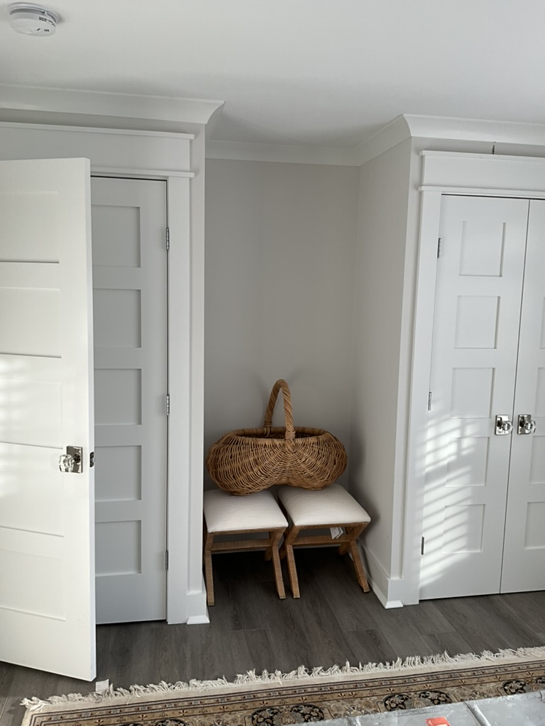
The bones were there. A linen headboard with elegant stud detailing, which our client loved and chose to keep. Natural light from a window that the previous owner had smothered beneath heavy drapery. And an awkward alcove between two closets — the kind of architectural in-between that most designers would simply ignore, or worse, fill with a forgettable console table from a big-box retailer.
We saw something else entirely.
The brief was deceptively simple: make the room feel serene, personal, and beautiful. Our client, who uses the guest room closet as an extension of her own, needed the space to work for her daily life while still offering an elevated, hotel-caliber experience for family and friends. Her aesthetic is what we lovingly call quiet luxury with a coastal whisper — cool tones, clean lines, an instinctive preference for silver and gray over gold and brass. She is not a maximalist. She does not want drama.
Except, as it turned out, she had been holding onto something dramatic all along: a collection of original prints bursting with vibrant yellow florals. Art she loved. Art she had never quite known what to do with.
Designing this room meant designing around that art — and making every cool, serene, carefully calibrated decision feel like it was always leading toward those extraordinary pops of color.
Client Goals: Function, Beauty, and a Corner Worth Noticing
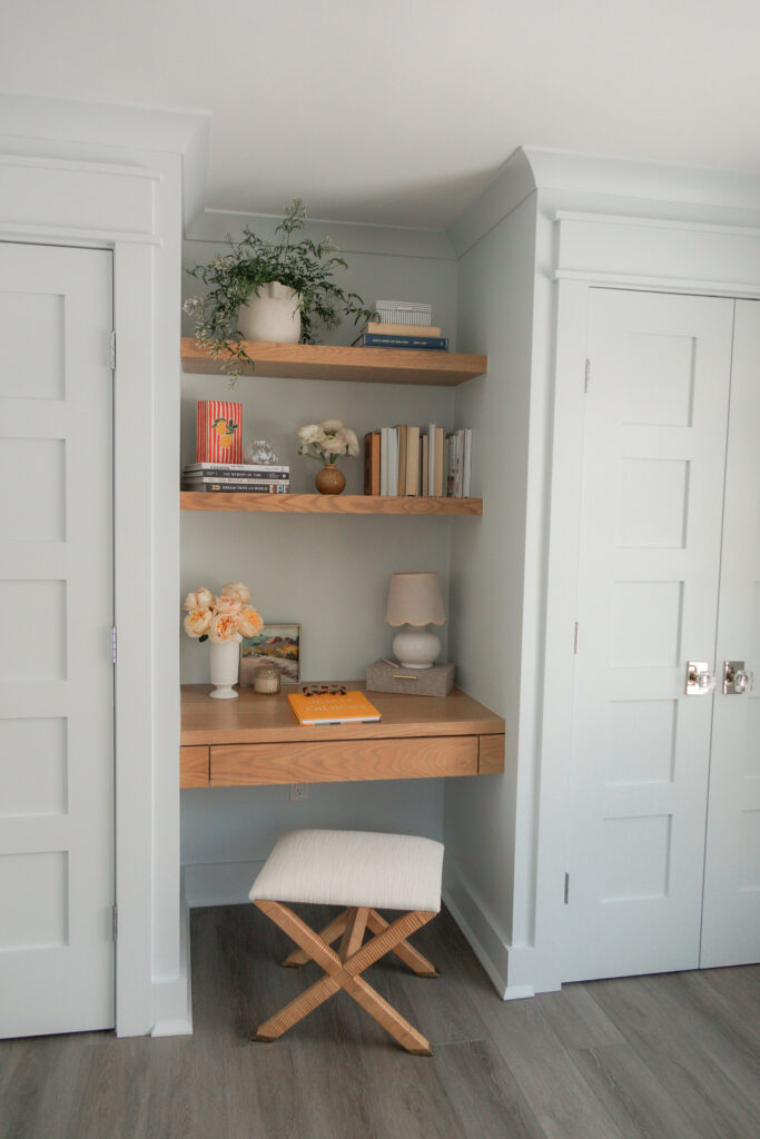
Our client had initially imagined a single piece of furniture to fill the alcove between the two closets — something simple, perhaps a slim chest or a small bench. But when we walked the space together and really looked at what that corner could become, a different picture emerged.
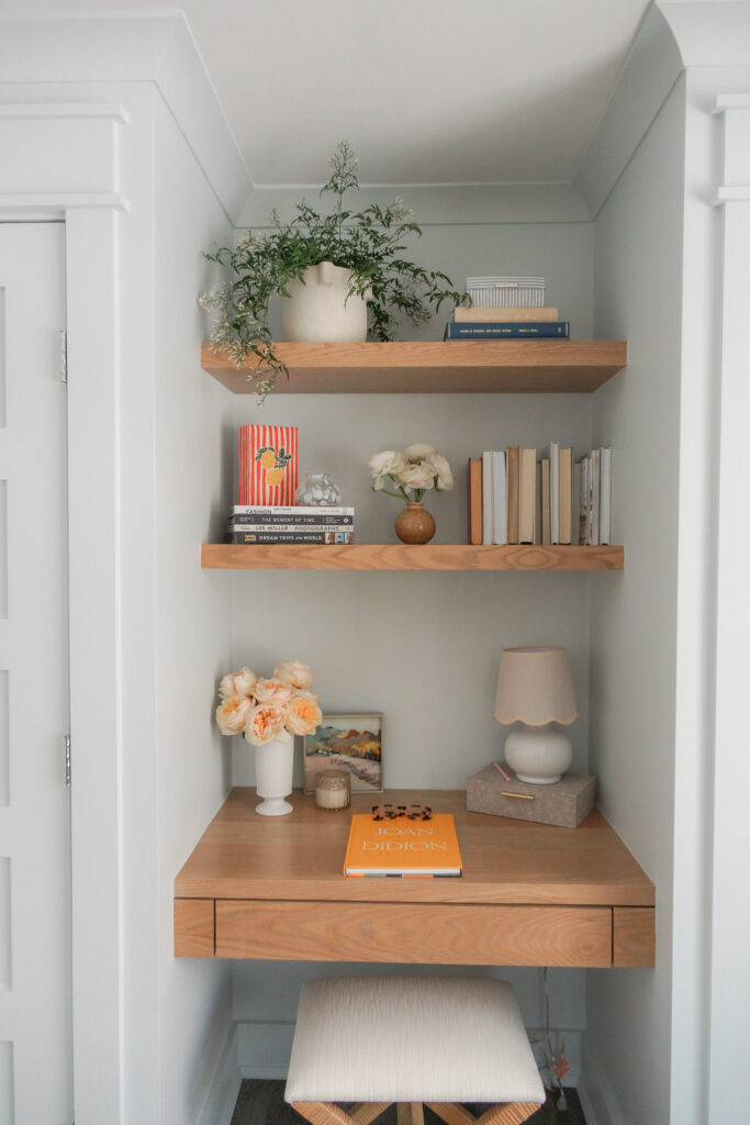
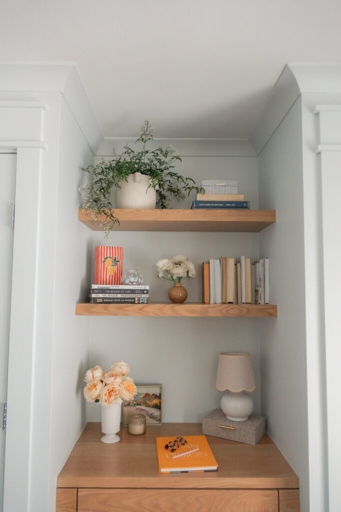
What she needed — what the space was quietly asking for — was a custom built-in desk and bookshelf combination. Not merely storage. A destination.
For a client who works from home but lacks a dedicated office, this alcove became an unexpected gift: a place to sit and answer emails in the morning light, to set down a new purchase from her carefully curated wardrobe, to arrange a small vignette of objects she loves. For guests arriving for a weekend stay, it offers a surface to set a glass of water, stack a few books, or charge a phone without disrupting the room’s careful order.
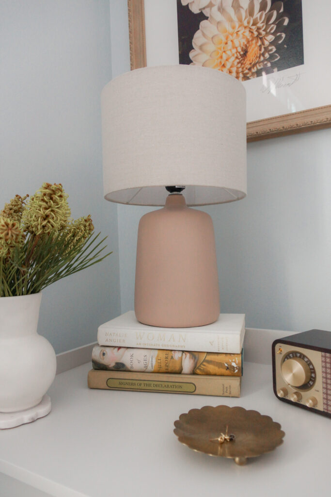
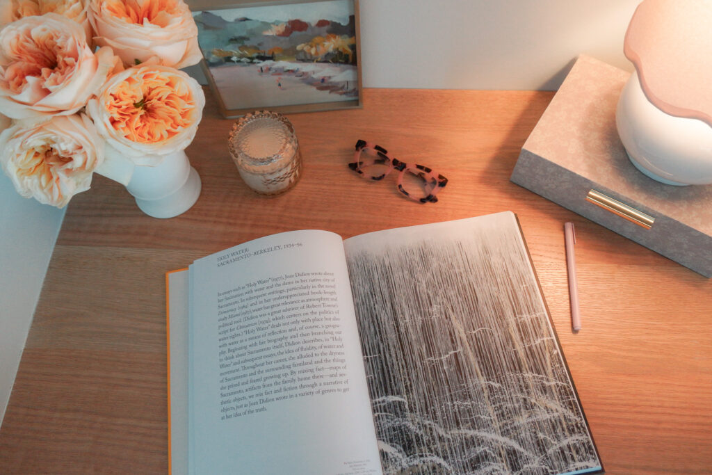
We also recognized immediately that the space had a lighting problem. With no overhead fixtures except for a simple ceiling fan in the bedroom, the room relied entirely on ambient light and surface table lamps— which meant evenings felt dim and slightly flat. The custom built-in gave us a third light source: a adorable petite light with scalloped shade detail, positioned beside a beautifully reframed original print. Combined with the low lamps on the end tables flanking the bed, the room now has layered, considered lighting that feels warm and intentional at every hour.
Beneath the desk surface, we designed a seamless drawer — barely visible, perfectly proportioned — stocked with a custom notebook and pens. A small, considered luxury for any guest who reaches for it.
The Challenges: Tight Spaces, Tariffs, and the Art of the Workaround
Every project has its friction, and this one had a few worth noting.
The alcove itself presented a spatial puzzle. The only available footprint for the built-in was the narrow corridor between two existing closets — a space that could easily have felt cramped or forced. The challenge was designing something that read as intentional and architectural rather than wedged-in and improvised. Proportions matter enormously in situations like this: too deep and the piece crowds the room; too shallow and it loses its sense of presence. We found the line.
The color story required careful navigation. Our client is, by instinct and preference, a committed neutral. Her palette is a study in restraint: whites, soft blues, silvers, grays. She had never introduced color into her Connecticut home’s interiors with any real conviction. And yet the art she wanted to feature in this room — vibrant, sunshine-yellow florals — demanded to be seen. The challenge was building a room that could hold that color without either overpowering it or being overwhelmed by it. The solution required a warm wood tone and a very specific shade of blue.
The timeline added its own layer of complexity. Our client had moved into her home with a long list of projects and, understandably, a growing impatience for results. We knew this room could be completed quickly enough to give her a meaningful win while the larger renovations were still in process. What we could not fully control were external supply chain pressures: a furniture market still recalibrating after the pandemic, and early production disruptions tied to new tariff structures. Some pieces arrived later than we had hoped. The finished room was worth the wait — but the wait was real, and we always believe in being honest with clients about what lies beyond our control.
The Solution: Every Decision Was a Conversation
Light Before Everything Else
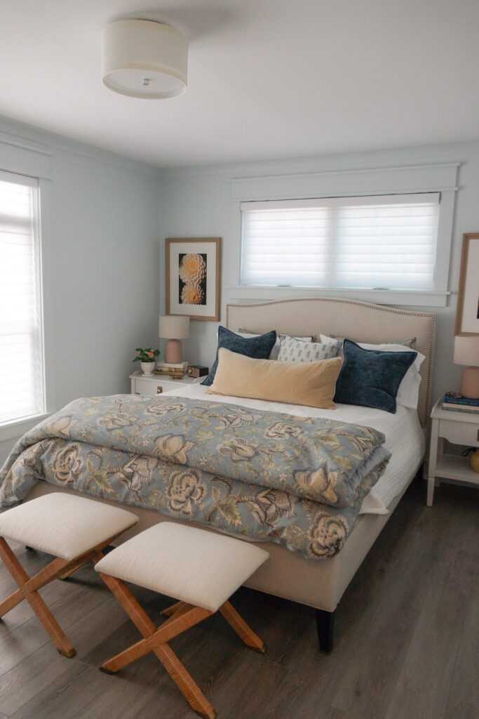
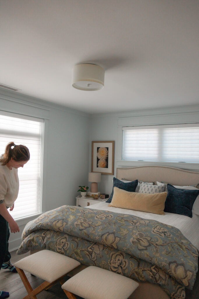
The first thing we did was remove the heavy drapery. It sounds simple. It was transformative.
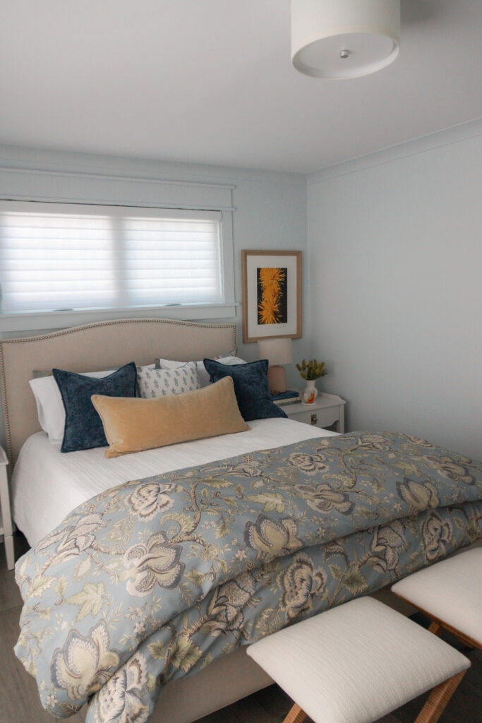
In a room this size, with a window this proportioned, heavy curtains do not add drama — they add weight. They compress the ceiling. They pull the eye down. Replacing them with a Hunter Douglas motorized shades in a tone we had also deployed in the client’s den created an immediate sense of openness and modernity. The room exhaled. Our client, who values clean lines above almost everything, saw it immediately. Sometimes the most luxurious intervention is the one that takes something away.
This is a principle we return to again and again in our Connecticut residential interior design work: restraint is not deprivation. It is curation. It is the discipline to remove what does not belong so that what remains can breathe.
The Color Palette: Borrowed Light
For the walls — and, crucially, the trim and doors — we selected Borrowed Light by Farrow & Ball, a color that defies easy description in the best possible way. It is blue, but barely. It is white, but warmer. In morning light it reads almost silver; in the evening it deepens toward a soft lavender. It is, quite simply, one of the most quietly extraordinary paint colors available, and it was the perfect vehicle for what this room needed: cool enough to feel serene, complex enough to feel designed.
By painting not just the walls but the trim and doors in Borrowed Light as well, we created what we think of as a color wash — an enveloping effect that makes the room feel larger, taller, and more cohesive. There are no visual interruptions. No white trim cutting the room into horizontal bands. Just a continuous, soft envelope of color that recedes beautifully and lets the furniture — and the art — do their work.
We had introduced this same blue in the client’s den, where she had responded to it more enthusiastically than she expected. Quiet luxury, after all, is not the absence of color. It is the presence of exactly the right color, applied with precision.
The Custom Built-In: White Oak, Warm Lines, and a Desk That Makes Sense
The custom built-in bookshelf and desk combination is the heart of this project — and the piece we are most proud of. It occupies the alcove between the two closets with a sense of belonging, as if the house had always planned for it to be there.
The material is stained white oak, chosen deliberately to introduce a warm, blonde wood tone into an otherwise very cool room. This was not decorative whimsy. It was structural to the color story: the yellow florals in the art prints find their echo in the honey tones of the white oak, which means the art no longer floats in the room as an anomaly. It belongs. The built-in made the art make sense.
The shelving lines are kept deliberately thin and light — sturdy, but never heavy. We wanted the piece to feel like furniture, not cabinetry. The proportions are generous enough to be useful but restrained enough to avoid dominating a room that prizes serenity above spectacle.
The seamless drawer beneath the desk surface is a small detail that earns significant return. Guests find notepads and pens; our client finds a dedicated surface for her daily routine. Function elevated to the level of refinement — which is, ultimately, the definition of good interior design.
The vertical storage the shelving provides also performs a subtle spatial trick. In a room that is not particularly wide, height becomes an ally. The built-in draws the eye upward, making the ceiling feel more generous and the room feel more considered.
The Furniture: Restraint as a Design Strategy
The guest bedroom is not a large room. Our client knew this. The selection of furniture was therefore as much about what we did not choose as what we did.
We retained the existing linen headboard with stud detail — a piece with real presence and texture that anchored the room beautifully against the Borrowed Light walls. The studs catch the light in a way that is quietly luxurious, adding dimension without pattern or color. It was exactly right, and keeping it was exactly right.
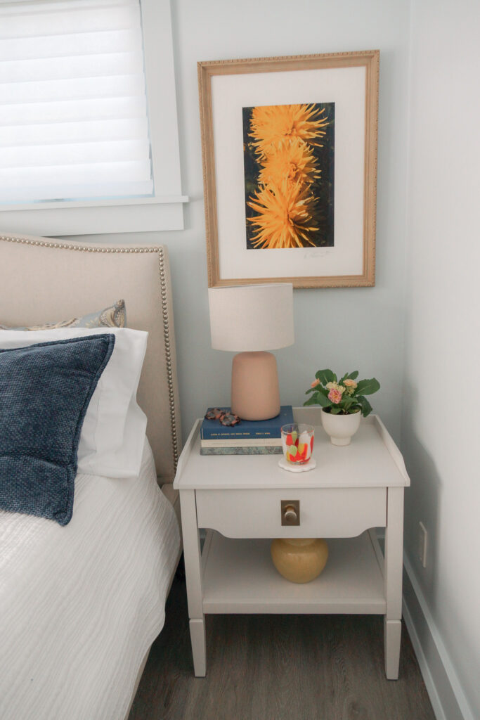
Flanking it, we introduced two simple white end tables at a scale deliberately calibrated to the room’s proportions. Low-profile lamps on each side complete the bedside composition without competing with the built-in or the art for visual attention. The simplicity of the end tables is a feature, not a compromise: in a room with this much considered detail, the bedside pieces needed to recede.
An accent stool — rattan, warm-toned, lightly coastal — sits at the foot of the bed and adds a layer of material texture without introducing pattern or color. It is the kind of piece that looks like it has always been there. It honors the coastal thread in our client’s aesthetic without leaning into it so heavily that the room tips from serene into thematic.
The styling throughout draws on a restrained vocabulary: natural ceramic vases in soft whites and taupes, a small brass footed tray that adds the faintest warmth to a cool surface, and a single yellow ceramic accent — a deliberate echo of the florals in the art, carried through to the smallest object in the room. Details like these are where a designed room separates itself from a decorated one.
The Hallway: A Small Space That Earned Its Moment
The corridor connecting the guest bedroom to the guest bath had been overlooked entirely by the previous owners. It was blank and utilitarian — a space to pass through rather than to experience.
We disagreed with that assessment.
One of the client’s most treasured photographs was reframed and hung in this small transitional space, accompanied by a Visual Comfort picture light. The effect is immediate and warm: a moment of personality in a space that had no excuse to be forgettable. The light pools beautifully on the image. Guests notice it every time. It transforms a corridor into a gallery, and a gallery — however small — into an experience.
This is something we advocate for consistently in our Connecticut interior design projects: transitional spaces deserve intention. Hallways, landings, the wall beside a door — these are the spaces that accumulate into the overall feeling of a home. Ignore them and the home feels unfinished, regardless of how beautiful the principal rooms may be. Attend to them and every square foot participates in the design story.
The Transformation
Before this project, the guest bedroom read as a placeholder — a room where defaults had been accepted and personality had never been invited. It was new without being interesting, neutral without being serene.
After? The room has a point of view.
The Borrowed Light walls wrap the space in a blue so subtle it feels like weather — like the particular quality of light on a Connecticut morning in early September. The white oak built-in anchors the alcove with warmth and intention, its thin lines and blonde tone a quiet counterpoint to the cool walls. The art — those vibrant yellow florals — finally has a room worthy of it. A room that was designed, quietly and deliberately, to make those colors sing.
The lighting is layered and warm. The furniture is scaled and considered. The hallway has a moment. And the corner that everyone used to walk past without a second glance has become, by every measure, the most interesting thing in the room.
Our client, who had never particularly thought of herself as someone who introduces color, now has a guest room with a personality she loves. Her guests arrive to a space that feels curated and calm — the kind of room that makes people reach for their phones to take a picture and then put their phones away because the room is better experienced than documented.
This is what thoughtful residential interior design in Connecticut — at its most intentional — can accomplish. Not renovation. Not reinvention. Simply the right decisions, made with care, in exactly the right sequence.
Key Specs & Sources
Paint: Borrowed Light, Farrow & Ball — walls, trim, and doors
Custom Built-In Material: Stained white oak
Window Treatments: Hunter Douglas motorized blinds
Picture Light: Visual Comfort Cabinet Maker’s Picture Light, Antique Nickel
Flush Mount: Kate Spade Walker Small Flush Mount via Visual Comfort
End Tables: Surya BODH-002
Accent Stool: Birch Lane Caserta Rattan Bench
Art Prints: Minted
Brass Footed Tray: Magnolia Scalloped Tray
Yellow Lumbar Pillow: Magnolia Heirloom Velvet Lumbar
Yellow Ceramic Vase: Room Essentials via Target
Ceramic Vases: At Home — Textured Natural · White 12″ · Small White
Retro Radio: Hearth & Hand Small Wood & Brass Radio (via Poshmark)
Pillows: HomeGoods (in-store find)
Interested in transforming a forgotten room in your Connecticut home? Get in touch to learn more about our residential interior design services.

